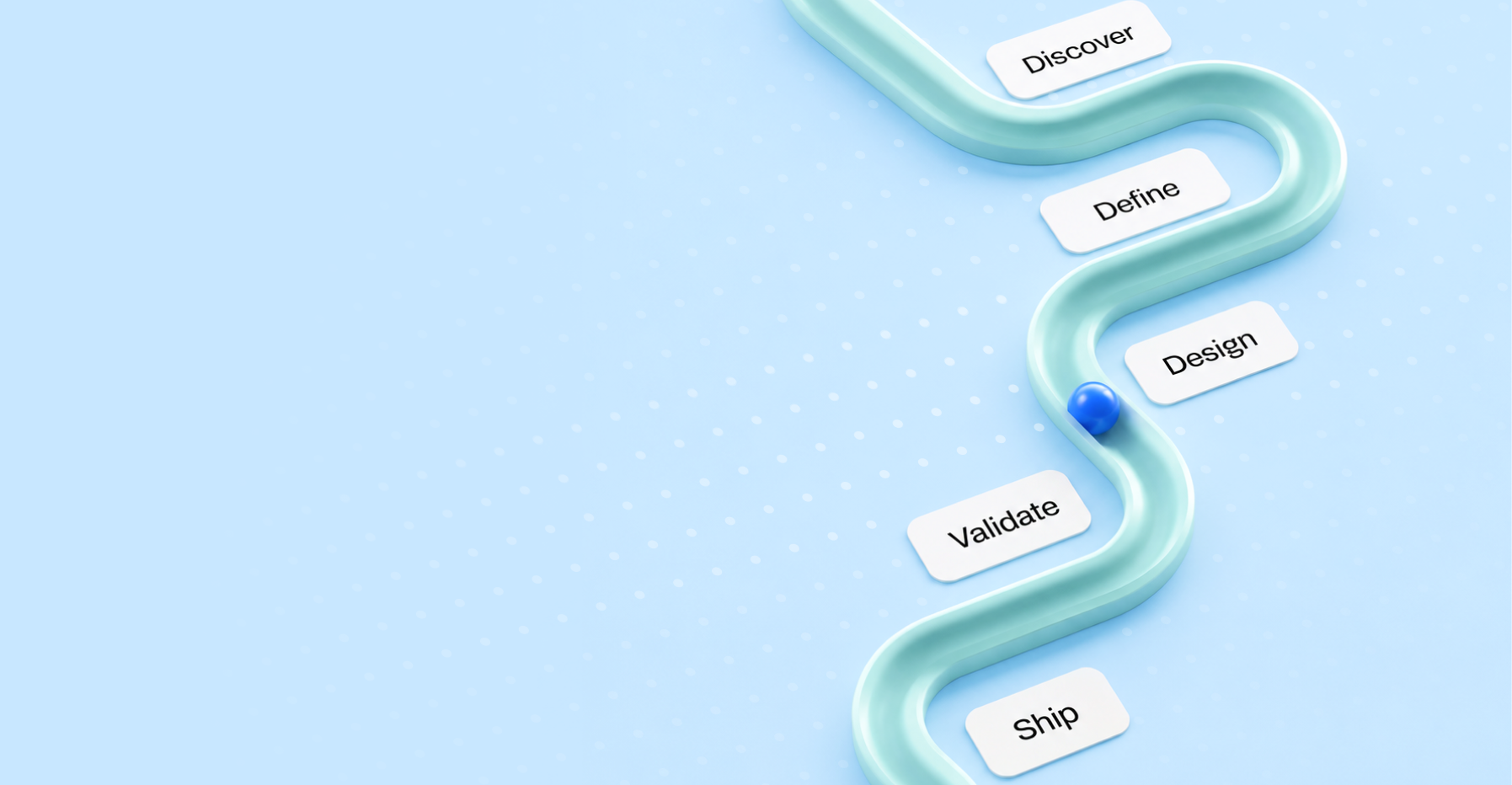
Your Product Isn't Too Complex. Your Story Is.
TLDR
Users can handle complexity; they do it every day, in the tools they run and the workflows they've built. What they can't handle is a complex product wrapped in a story that doesn't fit. At Peppermint, we've found many adoption and conversion problems come from that disconnect, not from the product itself. This article is about product storytelling: the gap between what your product does and how it's communicated, and why closing that gap matters more than simplifying the product.
It's for founders, product leads, and marketing teams at DevTools companies, AI-infrastructure businesses, and enterprise SaaS platforms who know their product is strong but keep losing people in the communication layer.

What is Product Storytelling?
Product storytelling is structuring communication about a SaaS product so the right user understands its value, in the right sequence, before they ever use it. It isn't copywriting and it isn't a marketing spin. It's the logic of how a product's purpose, context, and outcomes are presented across every surface: the website, the onboarding, the sales deck, the docs, and the interface. Strong SaaS product design carries that sequence all the way into the product, so the story the site tells and the story the interface tells are the same one.
The Wrong Diagnosis
There's a conversation in almost every SaaS team with a retention problem. Someone pulls the numbers: drop-off at day three, low activation, a trial-to-paid rate that should be twice what it is, and someone says it: “the product is just too complex.” From there, the next six months go one of two ways. Either the team spends a quarter simplifying features that weren't actually causing confusion, or they rebuild onboarding to be shorter and friendlier, and the numbers barely move.
The diagnosis was wrong. The product wasn't too complex. The story was. Users who leave in the first week aren't leaving because there are too many features; they're leaving because they couldn't connect what the product does to a problem they recognise as theirs. That's a storytelling problem, and it shows up in the hero, the first email, and the onboarding tour that demonstrates capability without ever explaining context. Fixing it doesn't need a simpler product; it needs a better structure for explaining the one you already have, which is as much a SaaS UX design question as a copy one.
Why Complexity Isn't the Problem
The products users commit to for years, their IDEs, monitoring stacks, and CRMs, are enormously complex. Figma is complex. Datadog is complex. Salesforce is complex enough that an entire profession of consultants exists to explain it. None of them succeed despite their complexity; they succeed because users understand, at some level, what they're getting into and why it's worth it. The complexity is expected, legible, and contextualised from the first moment.
The question is never “how complex is this product?” It's “does the user understand what the complexity is in service of?” That's the foundation of good technical product design: not making hard things easy, but making the structure of hard things visible. A well-built developer tools site doesn't hide a product's depth to lower the barrier, it shows the depth in the right sequence, problem first, capability last. The user who needs what you've built leans in instead of backing away.
The Three Places Product Stories Break Down
There are three common failure points in how complex products communicate. Most teams have at least one; enterprise SaaS and AI-infrastructure products often have all three.
1. The website leads with capability, not problem. A site that opens with a feature list is describing the product to someone who hasn't decided they need it. The visitor's first question isn't “what does this do?” but “do I have the problem this solves?” When the hero leads with capability, “AI-powered pipeline orchestration with native Kubernetes support,” only users who already know they need exactly that will stay; everyone else, including people who genuinely need it but don't recognise it yet, reads past the words without landing. The strongest positioning decisions happen before any design decisions: what's the problem, who has it, how does this change what happens next? Answer those and the design has something real to express. We see it on almost every devtools engagement, the product is good, the homepage is a feature list in a beautiful grid, and the work is structural, not visual.
2. The onboarding demonstrates rather than orients. The most common onboarding failure in complex products is the product tour, showing every feature in sequence as if the user's first need is a map of the territory rather than a path to where they're going. A new user doesn't need the full SaaS dashboard on day one, they need to complete one action that solves the specific problem they signed up for. Everything else is noise until that happens. The onboarding question isn't “what should we show?” but “what should the user be able to do in the first ten minutes, and what does completing it tell them about the value?” Good SaaS onboarding UX applies that lens from the first wireframe: onboarding isn't a tour, it's the first chapter of the product story, and tightening the SaaS onboarding process around one real outcome beats any number of tooltips.
3. The pitch explains instead of positions. This matters as much outside the product as in. A deck that spends eight slides on how the technology works before establishing the problem loses the room by slide four. Same with a sales sequence that leads with features, or a brand built around what the company does rather than what the customer gains. Positioning isn't simplification, it's prioritisation. The technical depth doesn't need hiding, the business problem just needs to come first, so the depth reads as proof of solution rather than complexity for its own sake.
What Good Product Storytelling Actually Looks Like
There's no single formula, but there's a structure that works across DevTools, AI, and enterprise SaaS.
Start with the moment of failure. Not a problem statement or a pain category, the specific situation where the user hits the wall your product removes. “Every time you ship a new service, someone updates three configs by hand and something gets missed” is a moment of failure. “Infrastructure management is complex” is a category. The moment of failure is specific enough that people who've lived it recognise themselves at once, and people who haven't aren't confused, they just know it isn't for them yet.
Show the structure, not the surface. The instinct is to show what the product looks like, the dashboard, the interface, the visual design. What users need is how it works, not the mechanics but the conceptual structure: how information flows, what they do first, second, third, and what the product does in the background. This is where motion earns its place rather than decorating, a 20-second animation from broken state to resolved state explains more than any screenshot. The same goes for architecture: a site organised around workflows communicates structure, one organised around features communicates inventory, and the SaaS dashboards that teach fastest show the flow, not just the data. Good SaaS designers design the sequence, not just the screens.
Earn the complexity. Once the user understands the problem and sees the structure, they're ready for depth, that's when the feature list, the integration grid, and the specs belong. Not before, not in the hero, not in the first email. This sequence is what separates products that feel powerful from products that feel complicated; the underlying complexity is often identical, the storytelling sequence isn't.
Capability-led vs Problem-led
The same product can read as complicated or powerful depending entirely on the order it's told in. Surface by surface, the contrast looks like this.
The Design Layer Isn't Neutral
All of this has design implications beyond copy. The choices a SaaS design agency or an internal team makes about visual hierarchy, layout sequence, and information density either support the story or fight it. A hero with six value props and a background video isn't just busy, it has no hierarchy. Every element competes for attention at once, and the user can't find the story because six stories are running at the same time. A beautifully built site on a confused architecture is still confused; the code was never the problem, the structure it expresses is. UI work that treats the interface as a purely visual problem without engaging the communication structure produces a beautiful product that users still can't follow.
The design layer is where the story becomes visible, not separate from it: every SaaS UX design decision- where the eye goes first, what gets space, what sits above the fold, is a storytelling decision, and weak SaaS UX quietly breaks the sequence even when each screen looks fine. It's also why maintenance is a storytelling function, not just a technical one. A product that ships features without updating the site, onboarding, and positioning is telling an old story about a new product, and that gap, the distance between what the product does and what the marketing says, is itself a clarity failure that tracks the SaaS product roadmap. Keeping the story current is as much a part of SaaS product development as the features themselves.
The Specific Case for DevTools and AI Infrastructure
The storytelling problem is hardest here, and that's worth saying directly. Developer tools often have multiple user types with different needs: the engineer who evaluates, the lead who approves the budget, the platform engineer who configures, the developer who uses it daily, and a site that tries to speak to all of them at once lands for none. AI-infrastructure products face a version where the category itself is still being understood, by users, the market, and buyers, so explaining the product to someone unsure what AI infrastructure even means takes even more deliberate structure.
“We use LLMs to optimise your pipeline” is technically accurate and communicates almost nothing; “your team spends a third of every sprint fixing data-quality issues before anything reaches the model” is something a buyer recognises. The depth is identical, the entry point isn't, one assumes the reader already understands the solution space, the other meets them at the problem. The brief should start with one question: who reads this first, what problem keeps them up at night, and what does the first sentence need to say to make them feel they're in the right place? Everything else, the SaaS UX design choices, the brand direction, the SaaS marketing strategy, follows from that answer. Decisions made before it are guesses dressed up as design. It's where the best UX design companies for SaaS products start, and where weaker B2B SaaS marketing skips straight to the feature grid.
The Practical Starting Point
If your product is complex and your story isn't working, the fix isn't a rebrand or a simpler product. Usually it's three changes.
- Find the moment of failure. Interview five users who churned in the first 30 days and ask them to describe, in their own words, the problem they signed up to solve. The gap between their description and your homepage is the story gap.
- Rebuild the architecture around their language, not yours. Not as a vanity exercise, their language is the language of the problem, and the problem is where the story has to start. This is more a SaaS product marketing decision than a visual one.
- Make the structure visible before the features. Whatever the product's logic is, the workflow, the data flow, the sequence of operations, show it before the feature list. Give the user a map of the territory before you list everything in it.
That's not simplification. The complexity is still there, it's the same product. The story now earns it instead of leading with it. We work with SaaS, DevTools, and AI teams on exactly this structural problem, and if your story isn't landing, that's where to start, with the story, before touching the design.
Frequently Asked Questions
What is product storytelling, and how does it differ from product marketing?
Product marketing covers positioning, messaging, and go-to-market. Product storytelling is specifically the sequence and structure in which information about a product is communicated, across the website, onboarding, sales materials, and interface. You can have good positioning and still have a broken story if the sequence is wrong.
Why do DevTools products specifically struggle with clear storytelling?
Because the builders know the product deeply and often write for an audience that shares that depth. But buyers and evaluators at different levels, team leads, engineering managers, CTOs, need the problem established before the capability. Devtools storytelling that works starts with the human problem, not the technical solution.
How does website architecture affect product storytelling?
Directly. The sequence of information on a page, what appears first, what sits above the fold, how sections relate, is a storytelling structure. A site organised around features tells a product story; one organised around user problems and workflows tells a human story, and the second converts better because it meets the reader where they are.
When should a company invest in design work versus fixing the story first?
Story first, always. SaaS UX design applied to a confused story produces a well-designed confusing experience. The story needs to be resolved before any visual work begins, because every design decision, hierarchy, emphasis, layout, is expressing the story. If the story is unclear, the design can't be.
Does a design agency handle storytelling or just design?
The stronger ones handle both, because they have to. Design without a story structure produces aesthetics without communication. A SaaS design agency that starts from visual direction before the story is resolved is building a surface with nothing beneath it.
What role does brand play in product storytelling?
Brand sets the frame for every story the company tells. The visual language, the tone, the naming all signal whether this product is for someone before they read a word of copy. A brand built around the problem the company solves gives the story a foundation; one built around the company's self-image leaves the visitor to work out the relevance themselves.
Can motion actually improve comprehension?
Yes, when used structurally. A motion piece that shows a workflow, the before state, the product action, and the after state is a compressed story, and it answers the workflow question (how does this fit what I do?) faster than paragraphs can. The failure mode is using motion as decoration rather than explanation.
How often should a company revisit its product story?
Every time the product changes significantly, the story should be audited. Maintenance in this sense isn't just keeping the site functional; it's keeping the story accurate. A product that has evolved past its homepage messaging, or past the story on its SaaS marketing website, is telling users something that is no longer true, which creates its own trust problem.