A Website That Turns Complex Analytics into a Clear Promise

About the Project
Kerny is a proactive AI analytical tool designed for website owners, founders, and small teams, developed by Peppermint. By connecting to Google Analytics, it autonomously monitors traffic and conversions, identifies obstacles to growth, and helps validate solutions through A/B testing.
The core philosophy behind Kerny is that users shouldn’t have to hunt for answers within reports — the product brings insights and actionable next steps instead. The main goal for us as product owners was to develop a site that would clearly communicate this message and lead up to the launch of our open beta.
The website’s purpose was to introduce Kerny and its features while bringing across what sets this “AI colleague” apart from standard analytics tools, guiding the visitor to the waitlist.
- Product positioning
- UX/UI design
- Motion design
- Web development
USA
Project Overview
Problem
The product was ready for its beta launch, but its focus on proactivity proved challenging to convey on the website. While developing the website, we faced several difficulties:
- The web analytics market is loaded with similar sites featuring dashboards, making it easy for Kerny to get lost in the crowd
- Terms like “AI” and “analytics” have lost their real impact
- Proactivity cannot be effectively communicated through a simple list of features
- With no case studies or testimonials available prior to launch, the site still needed to establish trust
The goal wasn’t to describe the product, but to prove its value and build a waitlist.
Solution
We built the website around the idea of Kerny being a proactive AI teammate rather than just a tool. To achieve this, we:
- Structured the narrative to flow from the user’s pain points
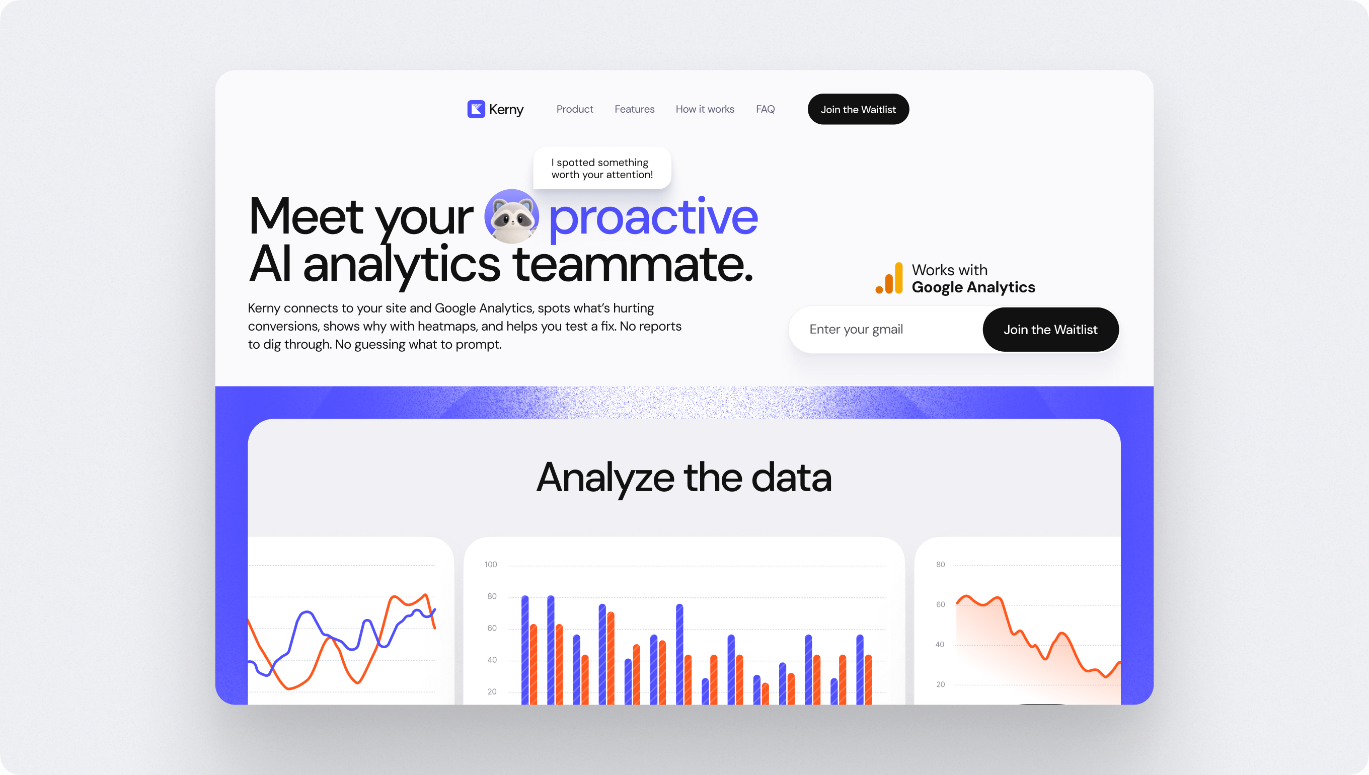
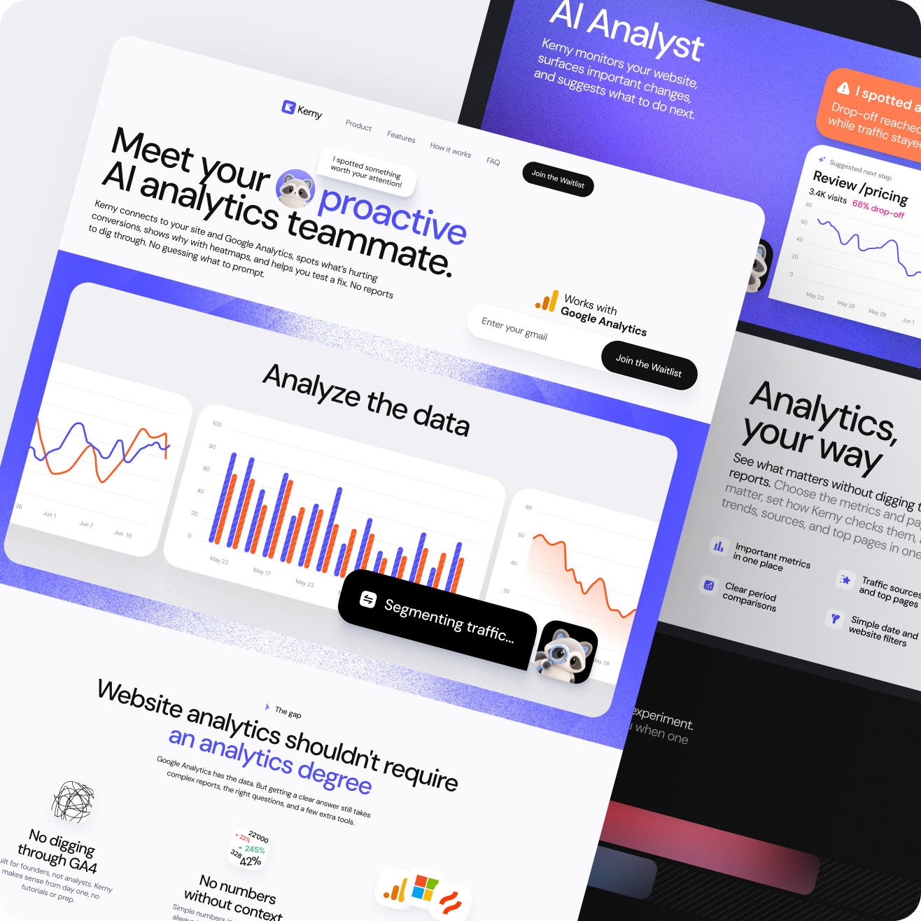
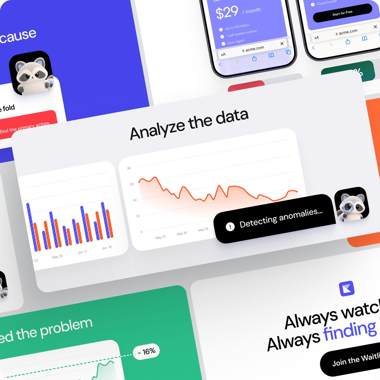
- Replaced static screenshots with dynamic cards, showcasing insights, metrics, and heatmaps
- Created an explainer video with a walkthrough for every flow
- Developed a clean layout reflecting the product promise: analytics that finally feel simple
The website guides the visitor toward a conclusion, just as Kerny guides the user toward an insight.
Result
Kerny received a website ready for an open beta launch and waitlist collection. This new foundation provided:
- A value proposition that is understood in seconds
- A visual language that sets Kerny apart from “another dashboard”
- A sense of a finished product, even before the launch
- A flexible foundation for new pages
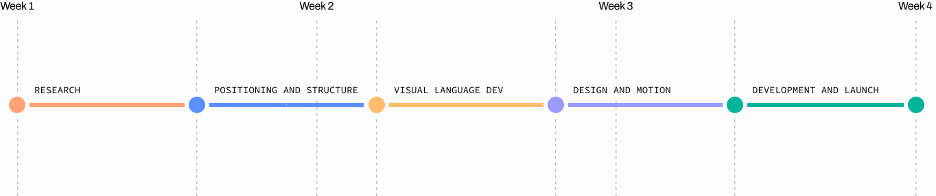
Weeks
From concept to launch-ready website
Product Philosophy
Product value is communicated through the interface
Launch Platform
The site was ready to gather early users from day one.
Process
What We Built
Narrative: From Problem to Waitlist
We structured the page as a conversation with founders struggling with GA4. This narrative is supported by:
- Identifying the main pain point and breaking it down into specific components
- Promising an “all-in-one” solution with each feature section
- Numbering onboarding steps to demonstrate that getting started takes a few minutes
By the end of the page, potential visitors’ questions are answered, and users are ready to join the waitlist.


The Interface as Proof
Instead of static screenshots, we assembled live demo components using recognizable elements from the product itself. Visitors see how Kerny works in action:
- The entire product loop, from spotting an issue to suggesting an action, is captured within a single card
- An hourly chart with every data point on the graph explained
- A/B test graphics that provide a clear, actionable verdict
- The site’s heatmap incorporated as an intuitive visual
The design prioritizes clarity, hierarchy, and readability over visual noise.
Product in Motion
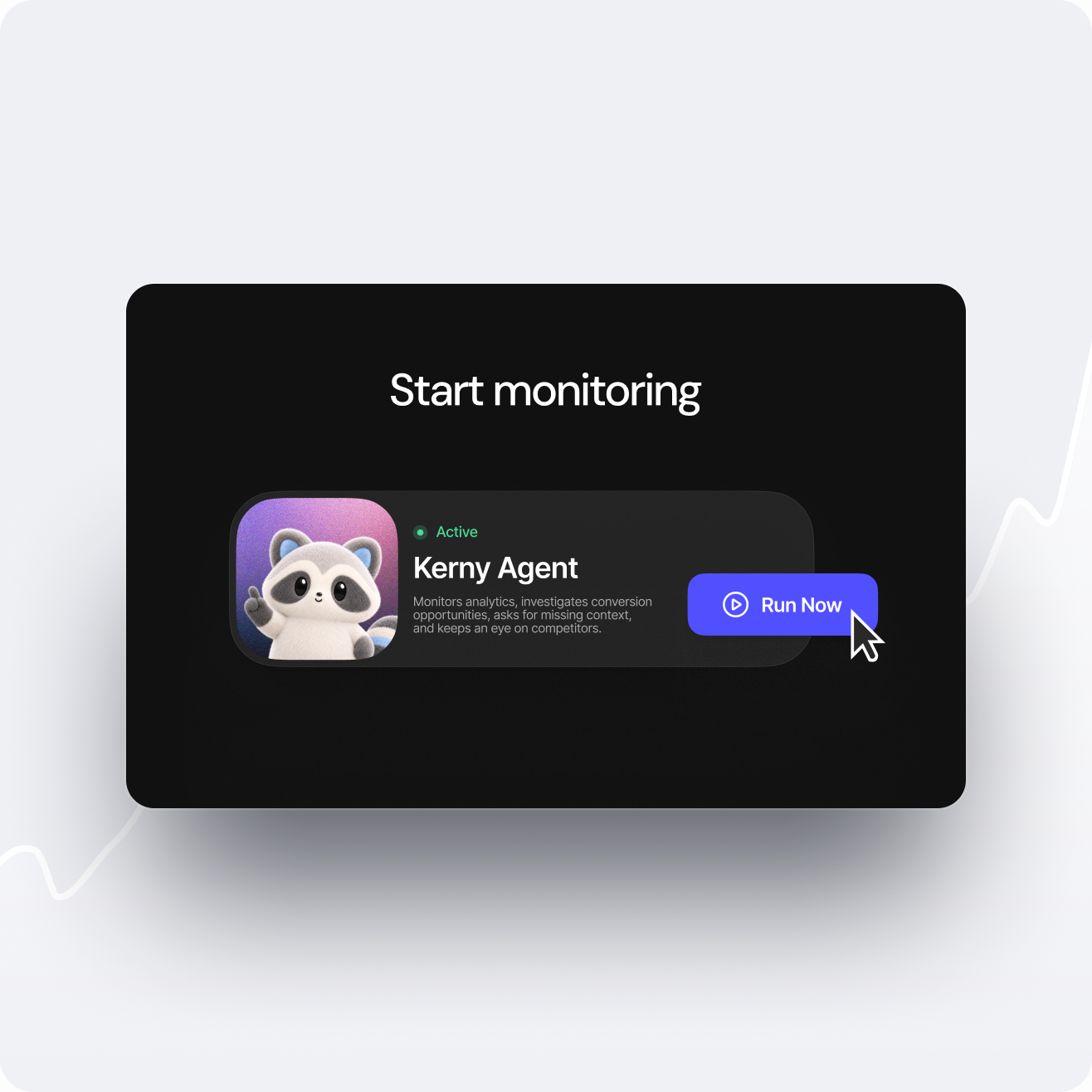
To showcase Kerny in action, we created an explainer video consisting of short scenes for each step of the product’s workflow:
- An agent card with a “Run Now” click to showcase a quick start
- How proactive alert notifications work
- Closing the product loop around the solution
- A bento-grid layout to bring the product features together
The promise of proactivity is transformed into a compelling story.


Development
The website is built on Next.js with a responsive layout. This ensures:
- Rapid iterations during the lead-up to the beta launch
- Fast performance on any device
- A flexible structure for future product pages
Strategic Takeaway
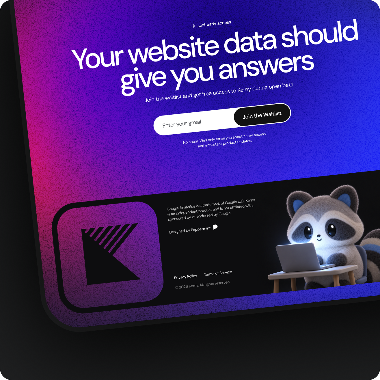
A complex AI product doesn’t need a list of features. It needs a personality. Creating a recognizable character and dynamic interface helped to:
We’ll transform complex technology into a clear, compelling story that sells from the very first screen.